
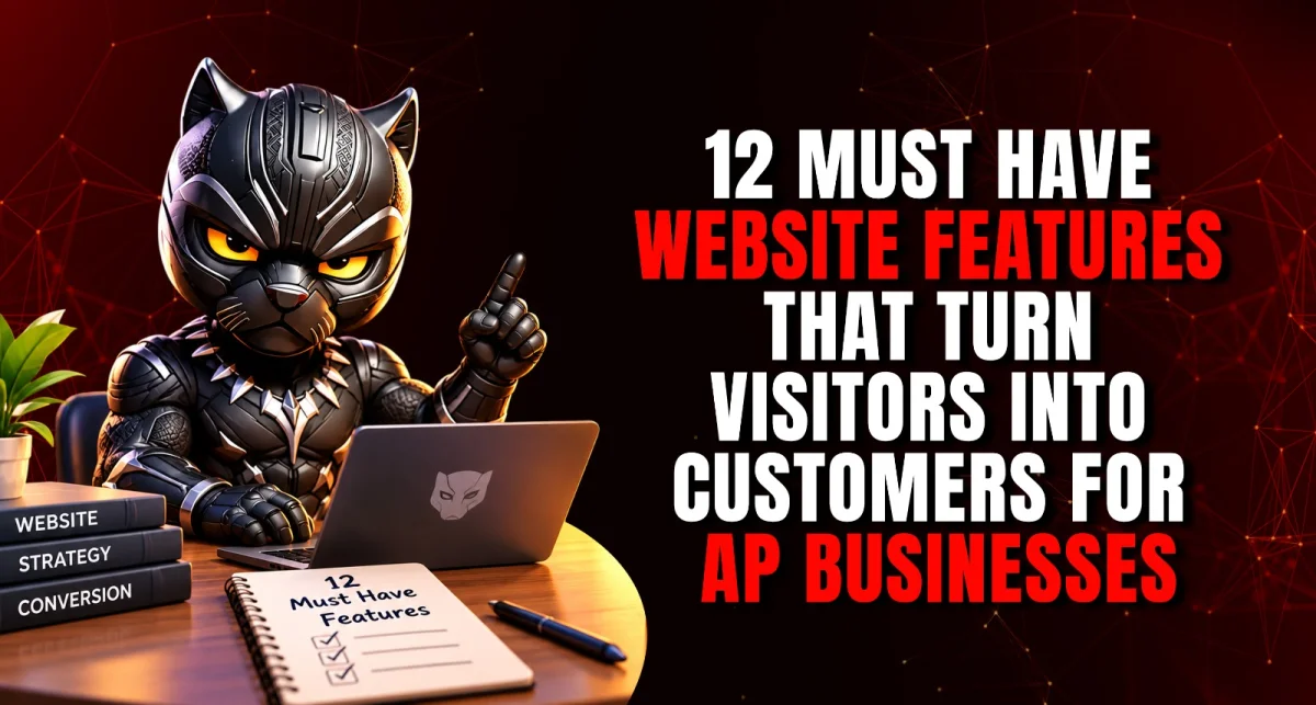
Most business websites in Andhra Pradesh look acceptable and convert almost nobody. Visitors arrive, glance at a slider, fail to find a price or a phone number, and leave for a competitor whose site took ten seconds less effort to use. The difference is rarely the design. It is the features.
This article covers the twelve website features for business in Andhra Pradesh that turn visitors into enquiries organised around how customers actually find, understand, trust and contact you plus a self-audit checklist you can run on your own site today.
Technical Avengers Pvt. Ltd. is a strategic growth agency Your Digital Task Force built on three forces: Business Consulting, Digital Strategy, and Advertisement.
Through Code Panther, our web development unit, we design and build conversion-focused websites for businesses across Vijayawada, Amaravati, Guntur, Tadepalli, Mangalagiri and wider Andhra Pradesh. With Technical Avengers, every strategy hits like Thor's hammer loud, bold, and unstoppable.
Most Business Websites Are Brochures, Not Salespeople
A brochure describes. A salesperson moves someone toward a decision. Most business websites were built as brochures: an About Us page, a list of services, a gallery, a contact page at the end and then owners wonder why traffic does not turn into enquiries.
Conversion-focused website design starts from a different question: what does a visitor need to see, believe and do, in what order, before they contact you? Every one of the twelve website features for business in Andhra Pradesh below answers part of that question. Together they map onto the stages of the customer journey.
Stage | What the visitor is thinking | Features that serve it |
Find | "Can I find this business, and does it load?" | Mobile-first design, speed, local SEO |
Understand | "Is this what I need?" | Clear value proposition, navigation, service pages |
Trust | "Can I rely on them?" | Reviews and testimonials, trust signals |
Contact | "How do I get in touch right now?" | Calls to action, click-to-call and WhatsApp, short forms |
Improve | (The owner's question) "What is working?" | Analytics and conversion tracking |
Also read: Why Every Business Needs a Digital PlatformEven Before Advertising
Stage 1: Be Found
1. Mobile-first design
Most of your visitors arrive on a phone, often a mid-range Android on a patchy network, often straight from a WhatsApp link or a Google Maps listing. A mobile-friendly business website is not one that merely shrinks to fit a small screen. It is designed for thumbs first: tap targets large enough to hit, text readable without zooming, the phone number and primary action reachable without scrolling and no layout elements that jump around as the page loads.
Design for the phone, then adapt for desktop. Not the other way round.
2. Fast loading speed
Speed is a feature, not a technical afterthought. Google's Core Web Vitals set clear benchmarks: the main content should load within 2.5 seconds, the page should respond to interaction within 200 milliseconds, and layout should stay visually stable (a layout-shift score of 0.1 or less). These are measured at the 75th percentile of real visits, split by mobile and desktop.
The usual causes of slow local business sites are predictable: uncompressed photos straight from a phone camera, heavy sliders, too many third-party scripts, and cheap shared hosting. Each is fixable, and fixing them improves both conversion and search visibility.
3. Local SEO foundations built in
Local SEO for businesses starts on the website itself, not just the Google Business Profile. Your site should carry your exact business name, address and phone number consistently on every page; location pages for each area you genuinely serve; LocalBusiness structured data so search engines and AI tools can read your details; and an embedded map.
This matters more each year. Pew Research Center found that when Google shows an AI-generated summary, only 8% of visits end in a click on a traditional search result, against 15% when no summary appears. Businesses with clean, structured, consistent information are the ones most likely to be represented in those summaries at all.
Also read: Local SEO Secrets: How to Rank #1 in Your City Without Paid Ads
Stage 2: Be Understood
4. A clear value proposition above the fold
A visitor decides within seconds whether they are in the right place. The first screen before any scrolling should answer three questions: what you do, who it is for, and what to do next. "Welcome to our website" answers none of them. "Orthopaedic and sports injury care in Benz Circle, Vijayawada book a consultation" answers all three.
Replace rotating sliders with one strong, specific statement and one clear action. Sliders look busy and almost nobody waits for the third slide.
5. Simple, predictable navigation
Five to seven top-level menu items is usually enough: Home, Services, About, Results or Work, Resources, Contact. Use plain labels customers would search for, not internal jargon. A visitor should be able to reach any important page in two taps from anywhere on the site.
On mobile, keep the primary call to action visible outside the hamburger menu. If your "Book Now" button is hidden inside a menu, most visitors will never find it.
6. Dedicated pages for each service
One "Services" page listing everything you do is a missed opportunity, both for conversion and for search. Each significant service deserves its own page that explains what it is, who it suits, what the process looks like, indicative pricing or a pricing approach where possible, common questions, and a clear next step.
Dedicated service pages let you rank for specific searches "kitchen interior design Guntur" rather than just "interior designer" and they let a visitor read about exactly what they came for without wading through everything else.
Is your website doing this job for you?
If you have read this far and recognised your own site in several of these points, you are not alone. Most business websites in this state were built to look professional, not to produce enquiries and the gap usually shows up as decent traffic and an empty inbox.
Our web development team, Code Panther, builds websites around the features in this article: mobile-first, fast, locally optimised, and designed around one clear action per page. If you would like to know which of these twelve your current site is missing, and what it would take to fix them, tell us about your business through our Client Discovery form. It asks about your goals, what you already have in place and the services you need, and our team comes back with an honest recommendation.
→ Get a quote for a conversion-focused website
Stage 3: Be Trusted
7. Reviews and testimonials
Trust is the conversion. BrightLocal's 2026 survey found 97% of consumers read reviews for local businesses, 47% will not consider a business with fewer than 20 reviews, and 74% weight reviews from the last three months most heavily.
Bring that proof onto your website: embed recent Google reviews, add short testimonials with a real name and context (with permission), and include specific outcomes where you are allowed to. Specific beats glowing "they fixed our billing software in two days" is more persuasive than "excellent service."
One important exception: doctors and lawyers in India face professional-conduct restrictions on testimonials and promotional claims, so regulated professionals should check what their rules allow before publishing them.
8. Trust signals throughout
Beyond reviews, small details tell visitors you are real and established:
Real photographs of your team, premises and work not stock images
A visible physical address and an embedded map
Credentials, certifications, registrations and memberships relevant to your field
Client or partner logos, with permission
HTTPS on every page, without browser security warnings
Clear policies privacy, refunds, delivery or cancellation, as applicable
An up-to-date copyright year and recent content, so the site does not look abandoned
None of these is dramatic. Missing several of them, however, quietly costs you enquiries every day.
Stage 4: Be Easy to Contact
9. Clear calls to action on every page
Every page should make the next step obvious. Use one primary call to action per page "Book a consultation", "Get a quote", "Check availability" and repeat it at natural decision points rather than only at the bottom. Action-specific wording outperforms vague buttons like "Submit" or "Click here."
This is the core of business website conversion optimisation: reducing the effort between interest and action.
10. Click-to-call and WhatsApp
In Andhra Pradesh, a large share of enquiries happen on WhatsApp or by phone, not through forms. Your site should have a tap-to-call phone number in the header on mobile, a WhatsApp button that opens a chat with a pre-filled message, and both visible without hunting.
Then make sure someone answers. An enquiry answered in minutes converts far better than one answered the next day. The website can create the opportunity, but only your response time closes it.
11. Short, focused contact forms
Every extra field reduces completion. For most enquiries, name, phone number and a short message are enough; collect the rest in conversation. Tell people what happens after they submit and how quickly you respond, show a clear confirmation and route the enquiry to someone who will act on it.
These are among the highest-impact lead generation website features, and among the cheapest to fix. Keep forms short, mobile-friendly, and explicit about how you will use the information people share.
Also read: How AP Businesses Can Win More Customers While Spending Less on Acquisition
Stage 5: Keep Improving
12. Analytics and conversion tracking
A website without tracking is a guess. At minimum, set up analytics with conversion events for the actions that matter: form submissions, phone taps, WhatsApp clicks and booking completions. Add UTM tags to links from campaigns, social posts and WhatsApp broadcasts so you know which source produced each enquiry.
Then review monthly. Which pages get traffic but no enquiries? Which sources produce enquiries that actually become customers? Those two answers tell you where to improve next and turn the website from a one-time project into a business asset that keeps getting better.
Website Self-Audit: Score Your Current Site
Open your website on your phone and answer honestly.
# | Feature | Yes / No |
1 | Designed for mobile first, easy to use with one thumb | |
2 | Main content loads in under about 2.5 seconds on mobile | |
3 | Name, address and phone consistent; location pages and structured data in place | |
4 | First screen states what you do, for whom, and what to do next | |
5 | Any important page reachable in two taps | |
6 | Each main service has its own page | |
7 | Recent reviews or testimonials visible | |
8 | Real photos, address, credentials, HTTPS and policies present | |
9 | One clear call to action on every page | |
10 | Tap-to-call and WhatsApp visible on mobile | |
11 | Contact form asks for three or four fields at most | |
12 | Enquiry actions tracked in analytics |
10–12: Your site is working. Focus on content and traffic.
6–9: Solid foundations with clear gaps fix the "No" answers in order.
0–5: The site is likely costing you enquiries daily. A rebuild around these features usually pays back faster than more advertising.
Common Mistakes That Quietly Kill Conversions
Auto-playing sliders and heavy animations that slow the page and bury the message
Hiding the phone number on the contact page only
One generic services page instead of focused service pages
Long forms that ask for everything up front
Stock photos where real ones would build trust
No tracking, so nobody knows which pages or sources work
Building once and never updating, until the site visibly ages
This Is Not Right for You If
You want a site that only looks impressive. We design for enquiries first; visual polish serves that, not the other way round.
Nobody will answer the calls and messages the site generates. A better website increases enquiries; it cannot respond to them.
You will not supply real photos, real details and real content. Trust features depend on genuine information.
You expect a website alone to bring traffic. The site converts visitors; SEO, content, social and advertising bring them.
Squad Deployment
Website development Andhra Pradesh businesses actually benefit from is rarely a design job alone.
Unit | Role |
Design and build mobile-first, fast, conversion-focused | |
Local SEO, structured data and AI search visibility | |
Messaging, value proposition and visual identity | |
Professional photography and video for trust and engagement | |
Campaigns and landing pages that send qualified traffic |
Also read: Digital Platform Architecture: Creating Online Ecosystems That Convert.
What to Measure
Metric | Why it matters |
Enquiry conversion rate | The share of visitors who contact you the headline number |
Phone taps and WhatsApp clicks | Often the majority of enquiries for local businesses |
Form completion rate | Shows whether your form is too long |
Mobile load time | Most visitors are on a phone |
Top pages by enquiries | Tells you which content earns business |
Enquiries by source | Shows which channels deserve more investment |
Enquiry-to-customer rate | Whether the site attracts the right people |
Build a Conversion-Focused Business Website With Technical Avengers
A website should be your hardest-working salesperson: available all day, consistent every time, and getting better each month. The twelve features above are what make that happen.
Our team builds website design for businesses in Andhra Pradesh around these exact principles and when we review an existing site, we start with the self-audit above and fix what will move enquiries fastest. These website features for business in Andhra Pradesh are the standard we hold every build to.
Build a conversion-focused business website with Technical Avengers or call +91 9030 218 219 or explore our web development services.
Technical Avengers Your Digital Task Force. From invisible to impossible to ignore.
FAQs
What are the most important website features for business in Andhra Pradesh?
Mobile-first design, fast loading, local SEO foundations, a clear value proposition, simple navigation, dedicated service pages, reviews, trust signals, clear calls to action, click-to-call and WhatsApp, short forms, and conversion tracking.
How fast should a business website load?
Google's Core Web Vitals benchmark is for the main content to load within 2.5 seconds, measured on real visits. Faster is better, particularly on mobile.
Is a mobile-friendly business website really necessary?
Yes. Most local visitors arrive on a phone. A site that is difficult to use on mobile loses enquiries regardless of how good it looks on a desktop.
Should my website have a WhatsApp button?
For most businesses in Andhra Pradesh, yes. Many customers prefer WhatsApp to forms or calls. Use a button with a pre-filled message and make sure someone responds quickly.
How many fields should a contact form have?
Usually three or four: name, phone, and a short message, with email optional. Collect other details in conversation.
Do testimonials help website conversions?
Generally yes, especially specific ones with a real name and context. Regulated professions such as doctors and lawyers should check their professional rules before using them.
What is conversion-focused website design?
Design that starts from what a visitor needs to see, believe and do before contacting you, and arranges every page around a single clear next step.
How do I know if my website is converting?
Track enquiry actions form submissions, phone taps and WhatsApp clicks in analytics, and compare them to visitor numbers by page and by source.
Should I redesign my website or improve the existing one?
Run the self-audit. If your site scores six or more, targeted improvements are usually enough. Below that, a rebuild often pays back faster.
How do I get started?
Get a quote through our Client Discovery form or call +91 9030 218 219.